Product Design · 2021–2022
Medikou
Designing a clinic discovery experience from zero in Japan’s fragmented healthcare market — surfacing the trust signals users needed to convert, in a context where COVID-19 had made digital the only option.
- Role
- UX Designer
- Team
- FounderPMBiz DevUI DesignerDesign Advisor
- Timeline
- 12 months
- Deliverable
- NPS 8 (target: 7)
The Problem
Japan’s healthcare market gave young adults access to over 180,000 clinics — yet 80% were failing to find a suitable one, and COVID-19 lockdowns had removed every offline fallback, making a broken digital discovery experience a real friction point rather than a passive inconvenience.
Building from zero with no existing product baseline, we established our own foundation through user interviews and moderated task sessions. The friction wasn’t in awareness — it was concentrated in the discovery and evaluation stages, where manually parsing 1M+ search results generated enough cognitive load to push users toward abandonment rather than commitment.
Research & Discovery
Before designing any screens, we needed to identify the friction points — to validate its existence. Research ran across 3 layers simultaneously.
Demand-side: understanding user behavior
A 2019 Medicare Life Insurance survey of 1,000 Japanese adults established our directional baseline, informing the founder’s NPS 7 target and 22–35 primary segment. We then structured 20 interviews to pressure-test those signals against actual behavior.
| Signal | Finding | Source |
|---|---|---|
| Hospital selection difficulty | 49.2% found it genuinely hard | Secondary |
| Primary discovery channel | 55.8% used Google | Primary |
| Search behavior | 72.1% followed near-identical prioritization patterns | Primary |
| Decision driver | 75% weighted reputation above all else | Primary |
| Task completion | 80% failed to find a suitable clinic | Primary |
The data reframed the problem — users had a clear mental model. The experience couldn’t surface the credibility signals that users relied on to make a decision.
Competitive analysis: studying trust signals across industries
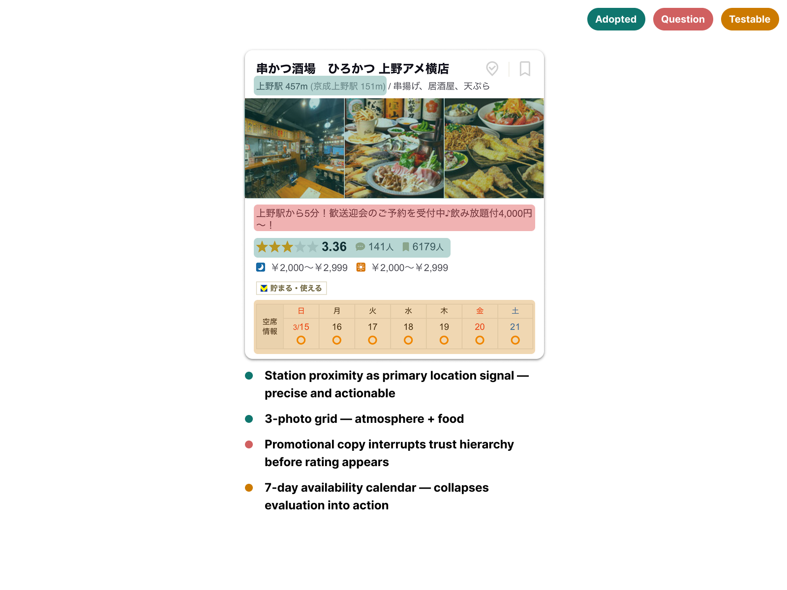
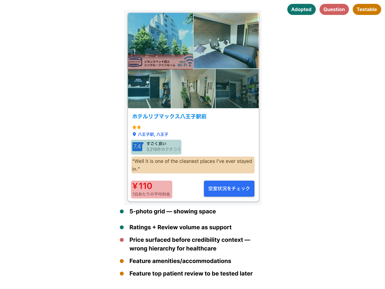
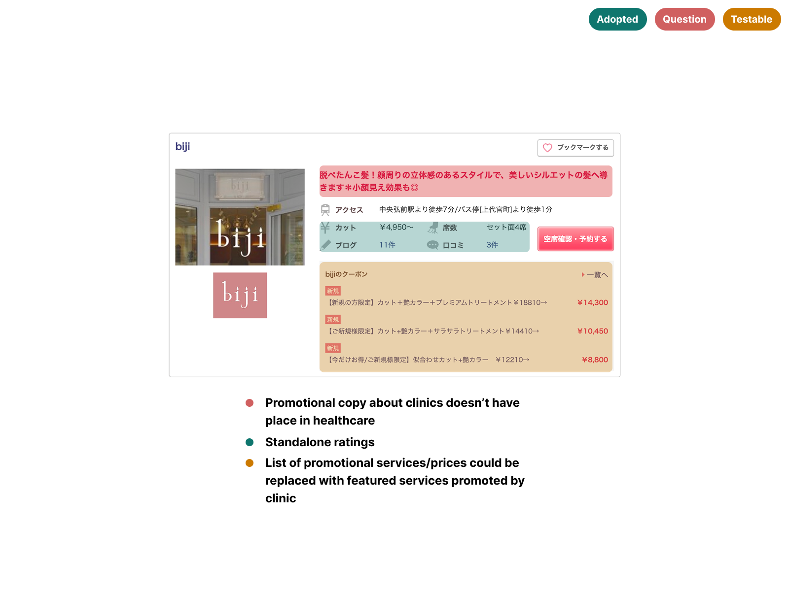
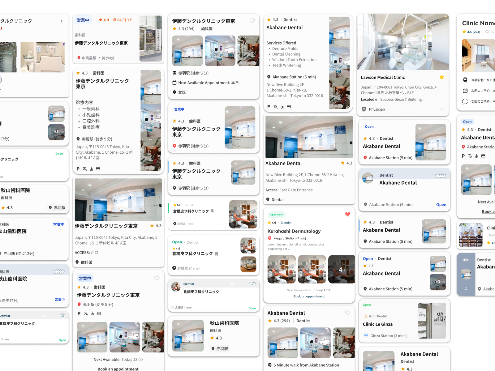
Knowing clinic cards would be the highest-impact surface, I audited 9 card designs across platforms where trust drives conversion — Tabelog, Booking.com JP, Suumo, Hotpepper Beauty, and TableCheck. Each card was annotated across three lenses: high trust signals worth referencing, questionable patterns to avoid, and features to test in later iterations.
The most consistent finding was pairing a rating score with review count outperformed standalone ratings. Volume validated the score — a 4.2 with 800+ reviews read as more trustworthy than a 5.0 with 3. Several platforms also displayed availability directly on the card, following common eastern UI density conventions — but in a high cognitive load discovery context, that vertical expansion added friction rather than reducing it.
Supply-side: understanding the clinic ecosystem
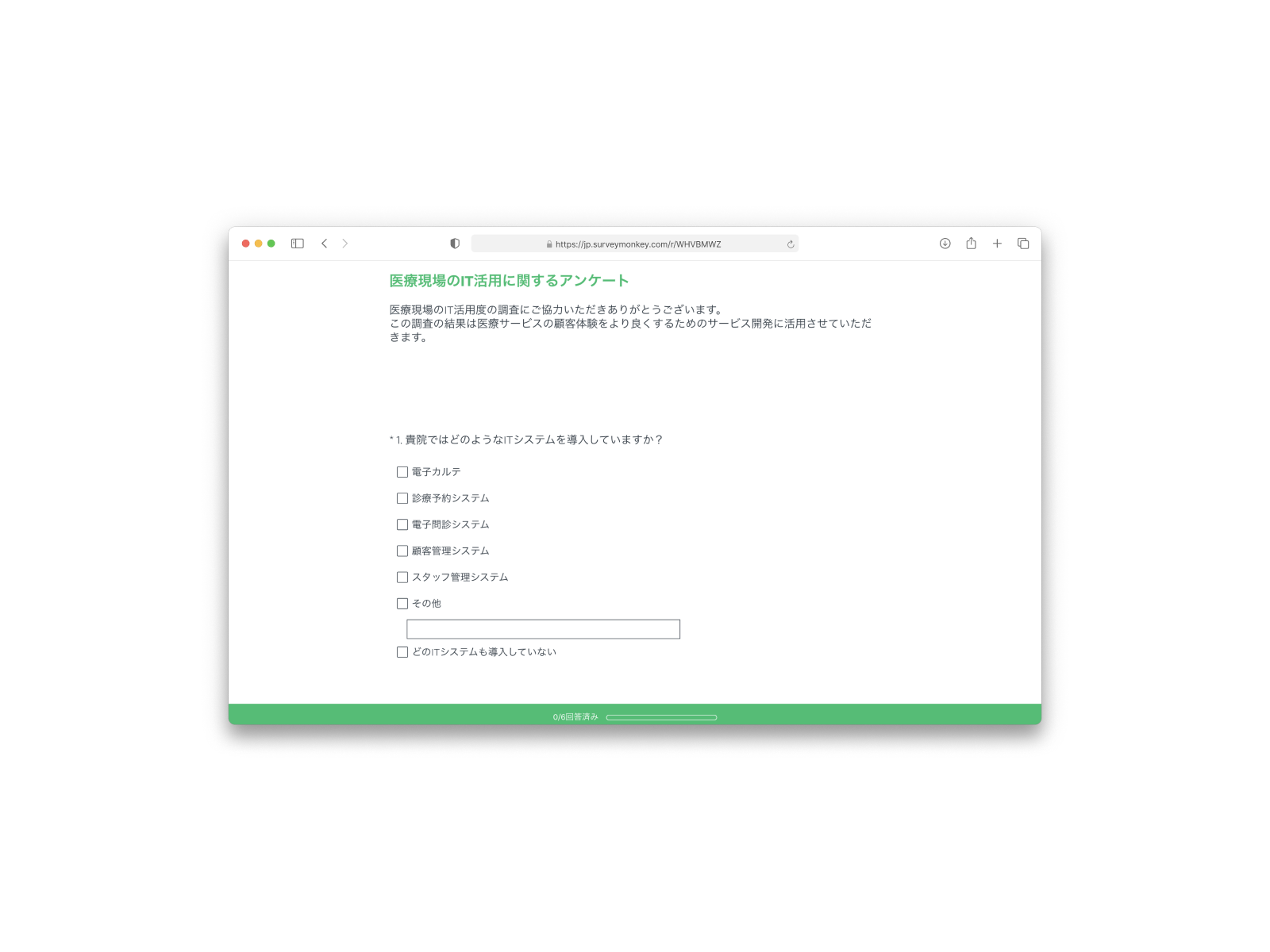
In parallel, our PM and business development manager distributed 100 SurveyMonkey surveys to clinics across Tokyo to assess booking and appointment management infrastructure.
Only 8 clinics responded across two rounds of usability testing. What that data revealed caused a significant pivot: each clinic operated a different tech stack for appointment management, making seamless in-app booking integration unfeasible within our timeline.
Hypothesis
Research showed clinic websites had no consistent information architecture — each one structured differently, few aligned with UI patterns users already recognised. We hypothesized that if Medikou surfaced clinic details in a standardised format, users could evaluate options faster, reducing the cognitive friction that was driving abandonment and improving task completion within the discovery flow.
Process & Collaboration
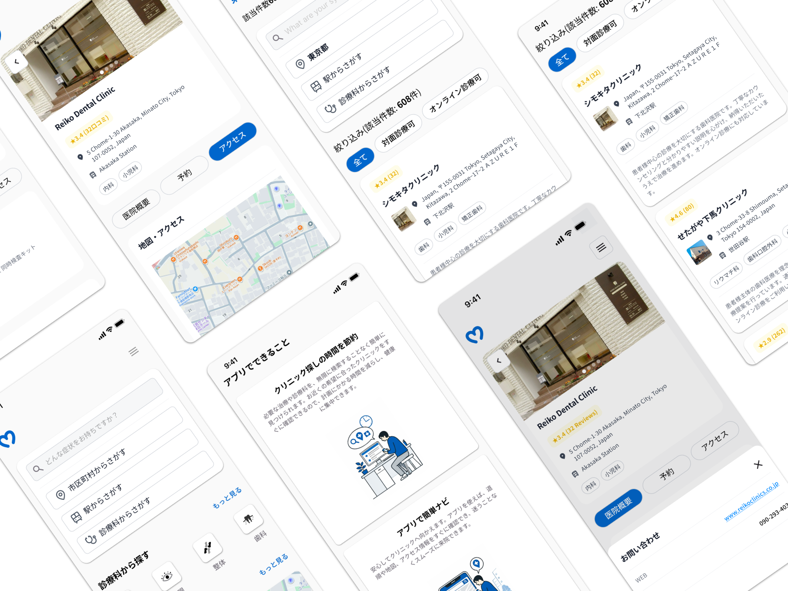
Given our timeline constraints, we moved directly into mid-high fidelity screens rather than a traditional wireframing phase — a deliberate call to compress the feedback cycle and test with higher visual fidelity earlier.
Testing with cultural precision
Most sessions were facilitated by our UI designer — a Japanese native — to keep interactions natural for participants; I ran two directly with English-comfortable users. Across four iterations and 8 usability sessions, I led design changes emerging from each round, synthesizing findings with our PM and design advisor to keep the team aligned between rounds.
Navigating the messy middle
Clinic survey responses arrived in two staggered batches — six during the first testing round, two more during the second — meaning feature decisions were made with incomplete supply-side data. When the booking flow pivot became necessary, I worked with our design advisor and PM on a prioritization matrix that shifted the founder’s position from in-app booking to assisted-booking as the more viable path.
Competitive analysis annotation (9 card designs across 5 platforms)
Mid-high fidelity screens across 4 iterations
8 usability testing sessions
Prioritization matrix (booking flow feasibility)
Offshore development handoff documentation (under NDA)
Visual design and accessibility
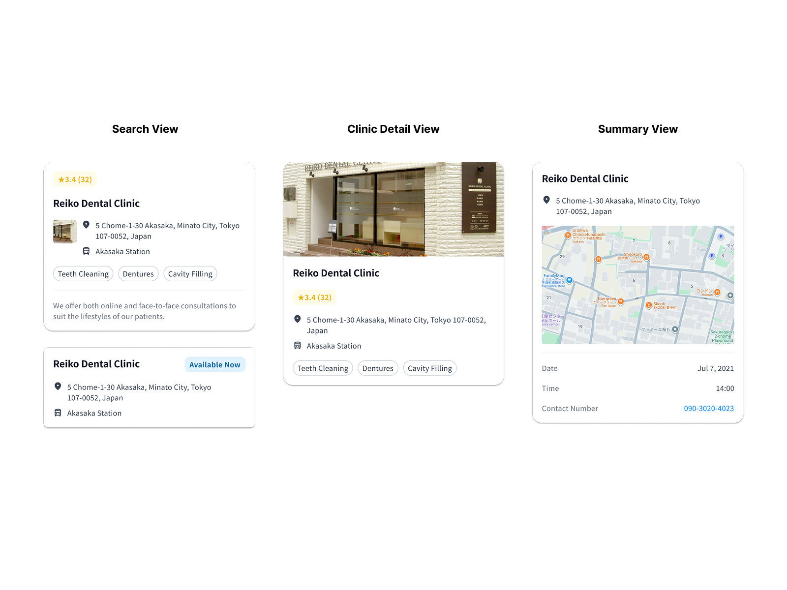
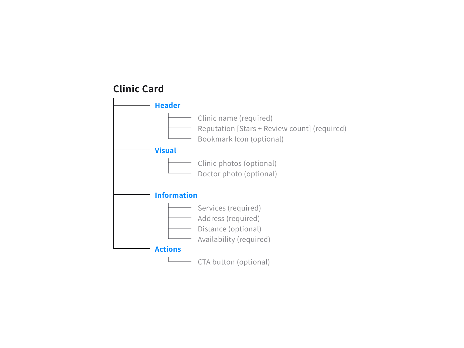
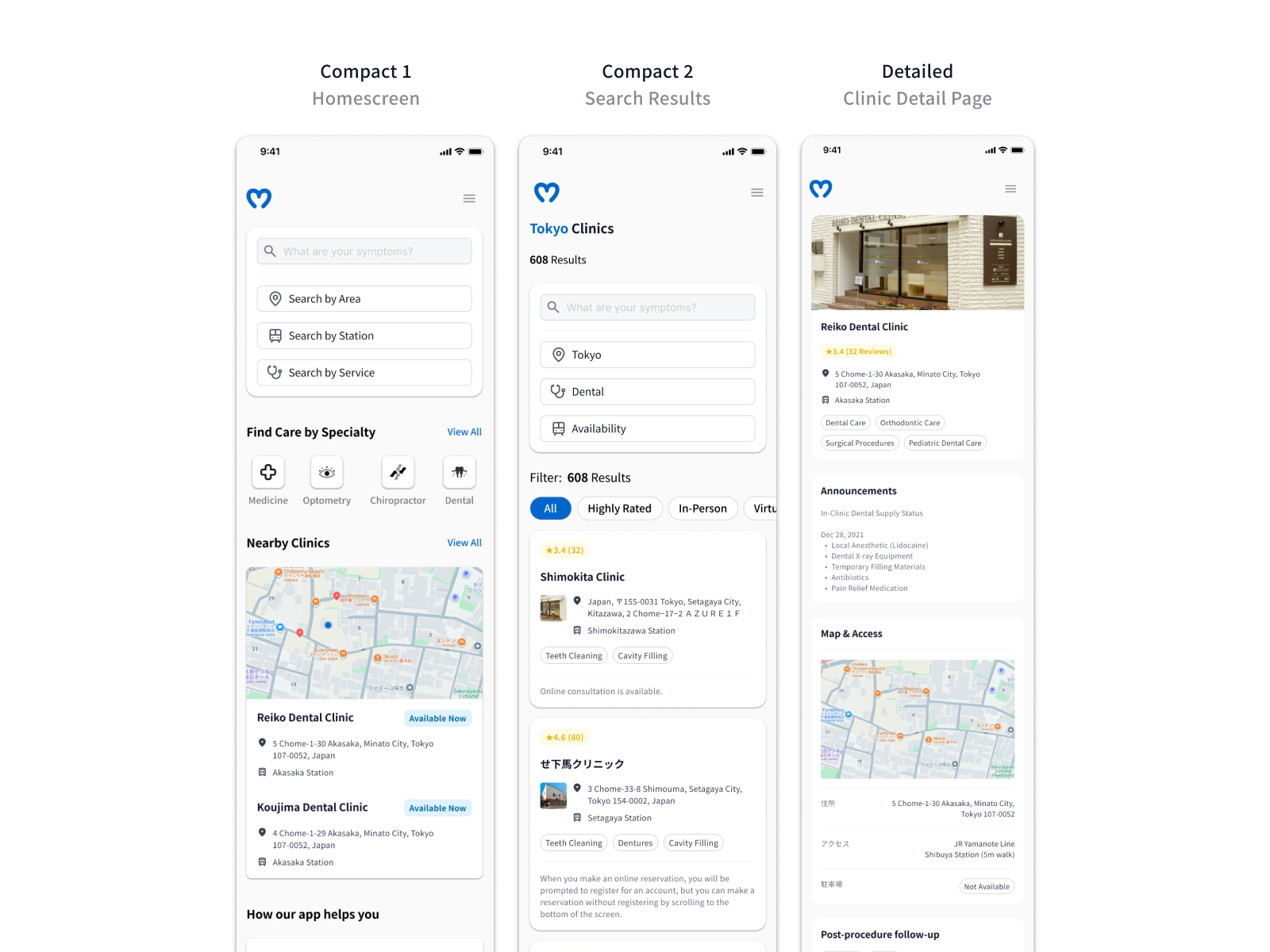
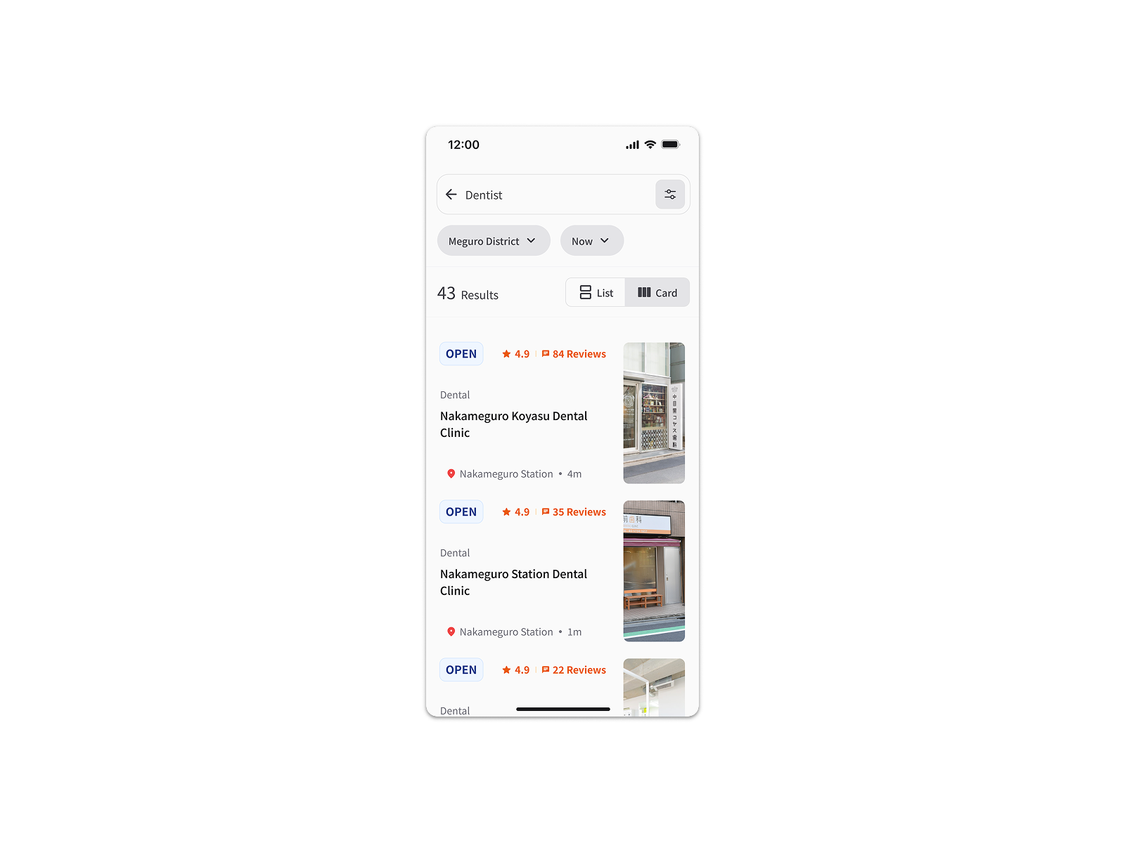
Card components were built for reuse across three surfaces — homescreen, search results, and clinic detail — maintaining consistent hierarchy between credibility signals, location, and availability. Consolidating shared patterns early reduced the annotation burden at handoff: fewer one-off specifications meant faster development without sacrificing documentation clarity. Accessibility ran throughout — status indicators used colour and text rather than colour alone, and touch targets and type scale were sized to JIS X 8341-3 standards.
Handoff
With our development timeline approaching, designs were packaged and handed off to the offshore development team. Full specification documentation was produced but remains under NDA. The contract concluded at this stage — post-launch instrumented data was not available as a result.
Design Decisions
Credibility Signals over Simplicity
Rating scores alone weren’t converting users — without review volume, a 4.3 carried no weight. Pairing the score with review count gave users the signal their decision-making relied on: a 4.3 with 294 reviews reads as earned, not arbitrary. We also removed the explicit card CTA after testing showed no meaningful difference in click behavior — reducing noise on a surface already carrying rating, location, and availability.
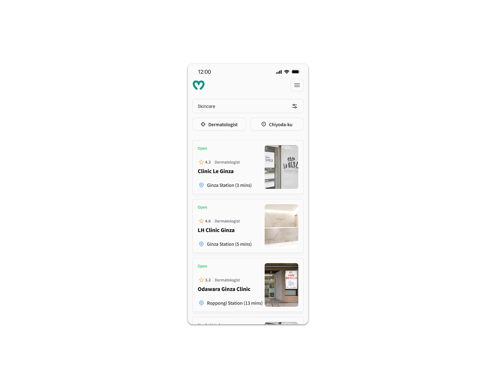
A standalone score tied directly to our 80% task failure rate — users told us during testing it wasn’t convincing enough to act on. Keeping the explicit CTA would have added complexity without benefit.
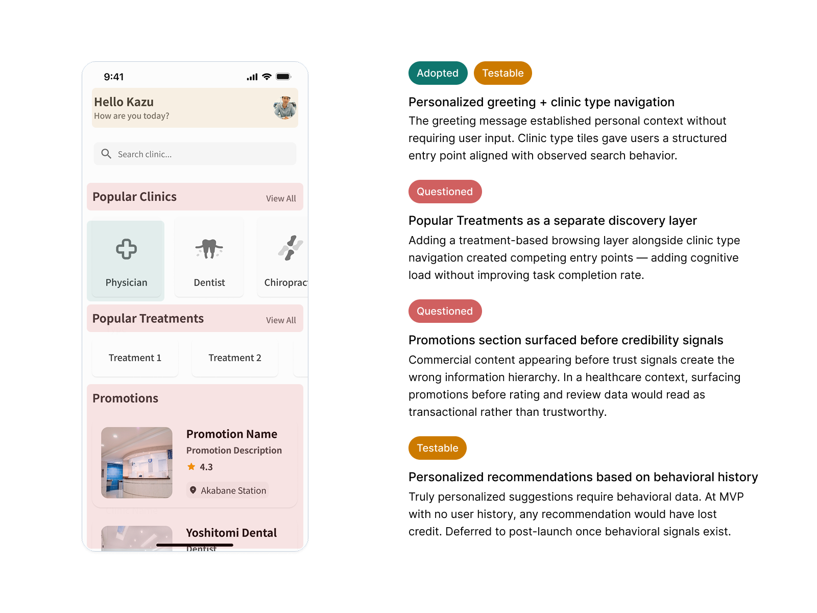
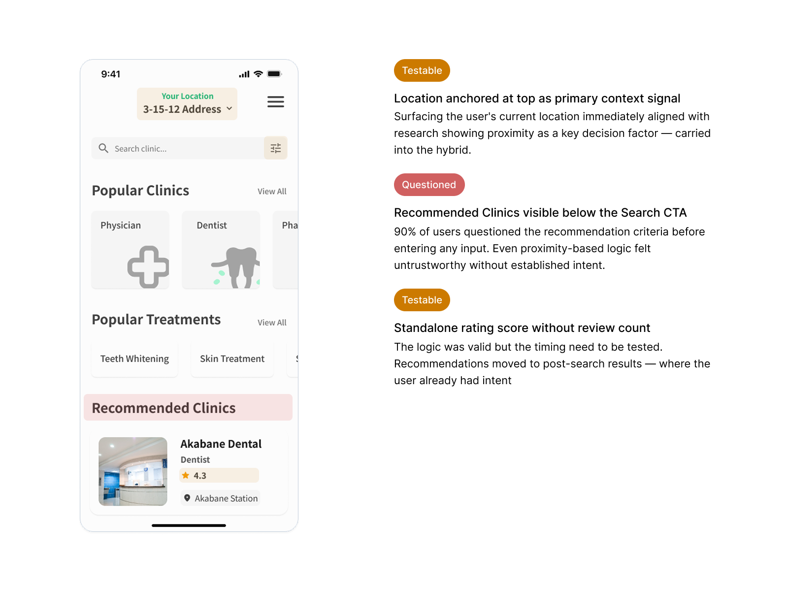
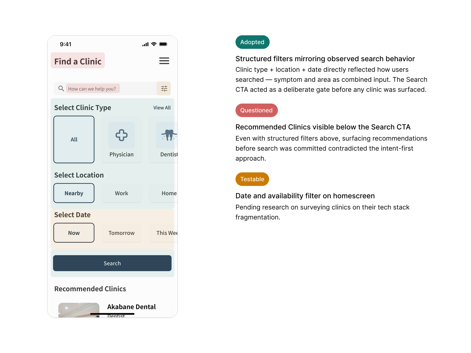
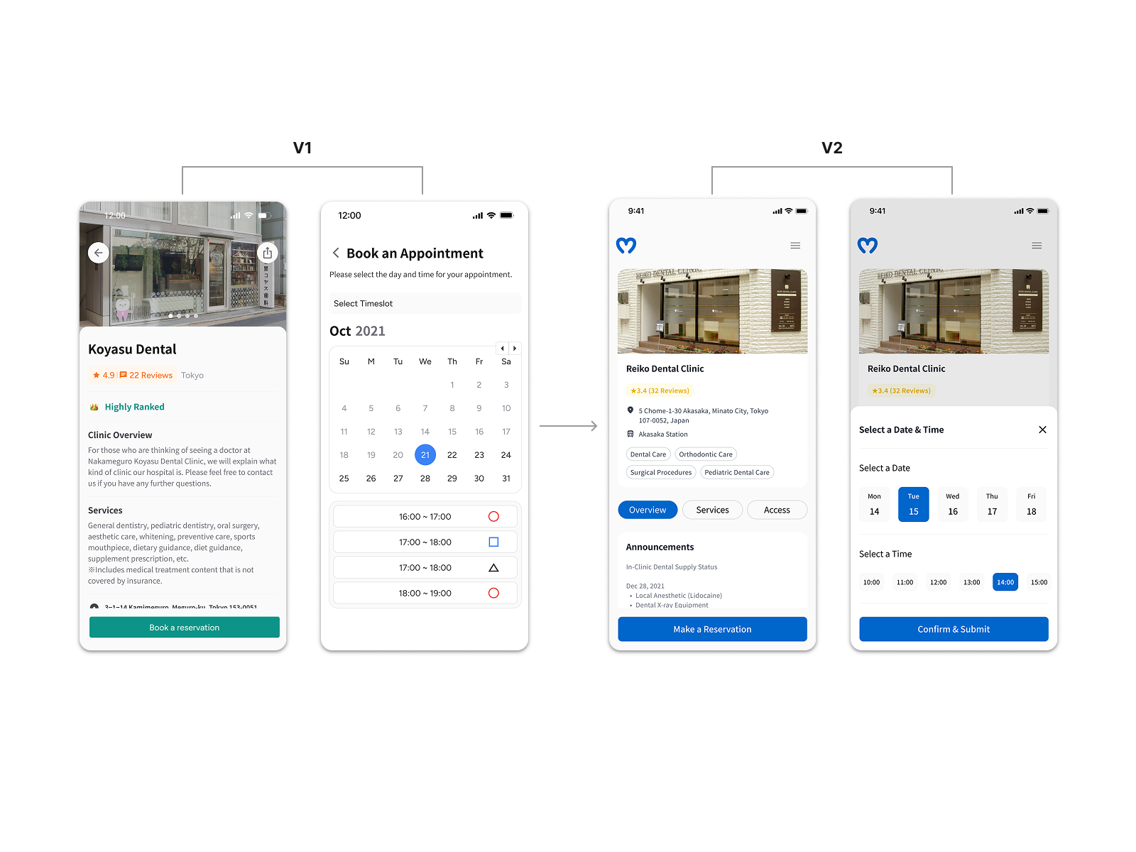
Removing Recommendations Before Search Input
V1 surfaced location-based clinic suggestions before the user had typed anything. During testing, 90% of users questioned the criteria behind those suggestions — invisible logic in a healthcare context reads as untrustworthy. Removing them gave users full control from the start, matching the mental model research had identified: they knew what they were looking for, they just needed the right surface to find it.
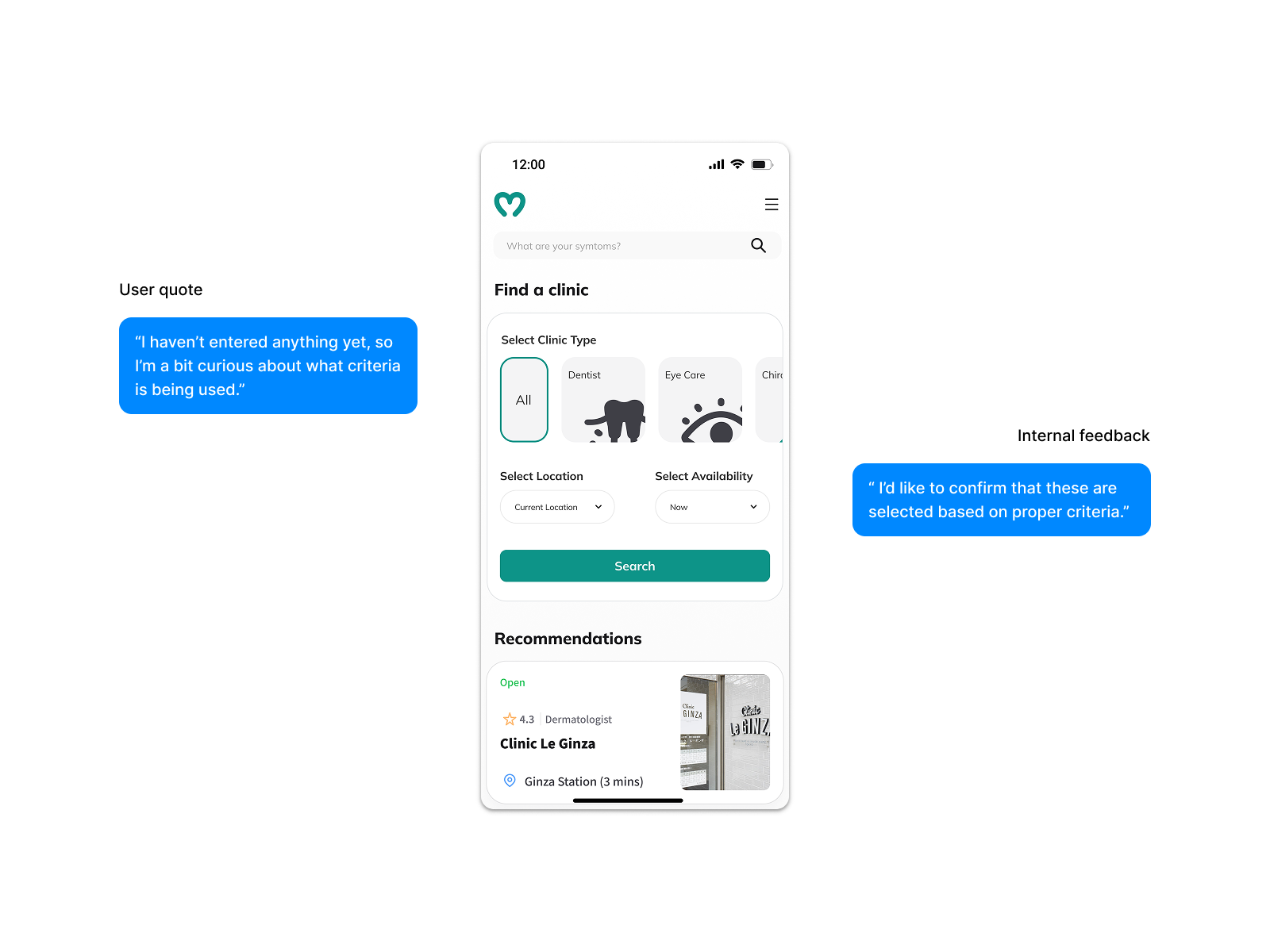
The alternative required either explaining the ranking algorithm — adding cognitive load before search — or accepting the trust erosion. Neither was an option when trust was our primary conversion driver.
Assisted-Booking over In-App Booking
Supply-side research revealed that each of the 8 responding clinics ran a different appointment management stack — seamless in-app booking was unfeasible within our four-month timeline. Rather than dropping the booking goal, we reframed it: the design surfaced everything a user needed to contact a clinic directly — address, phone, website, and next available window via Google API. The user goal stayed intact; the completion step moved off-screen.
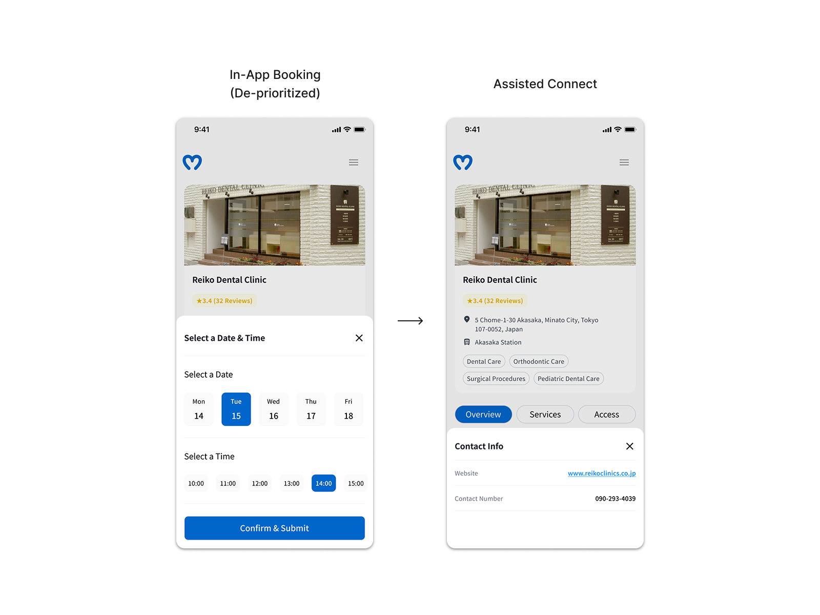
The founder pushed to preserve in-app booking regardless of the constraint. A prioritization matrix with our design advisor and PM shifted that conversation from intent to feasibility. One open question remained: how to measure off-screen booking completion. We aligned on click-through to clinic contact as a proxy — directional, not definitive, but workable within the constraints.
Outcomes & Iteration
| Metric | Baseline | Final | Target |
|---|---|---|---|
| NPS | 4 | 8 | 7 |
| Clinic search time | 12 min | ~7 min (40% reduction) | — |
The NPS progression tells the more complete story: starting at 4 during baseline observations of users searching via Google, improving to 5 after the first testing round, and reaching 8 after the second. The jump between rounds 1 and 2 was the clearest validation that the trust signal decisions — rating paired with review count, recommendations removed from pre-search state — were directly improving user confidence.
What I’d do differently
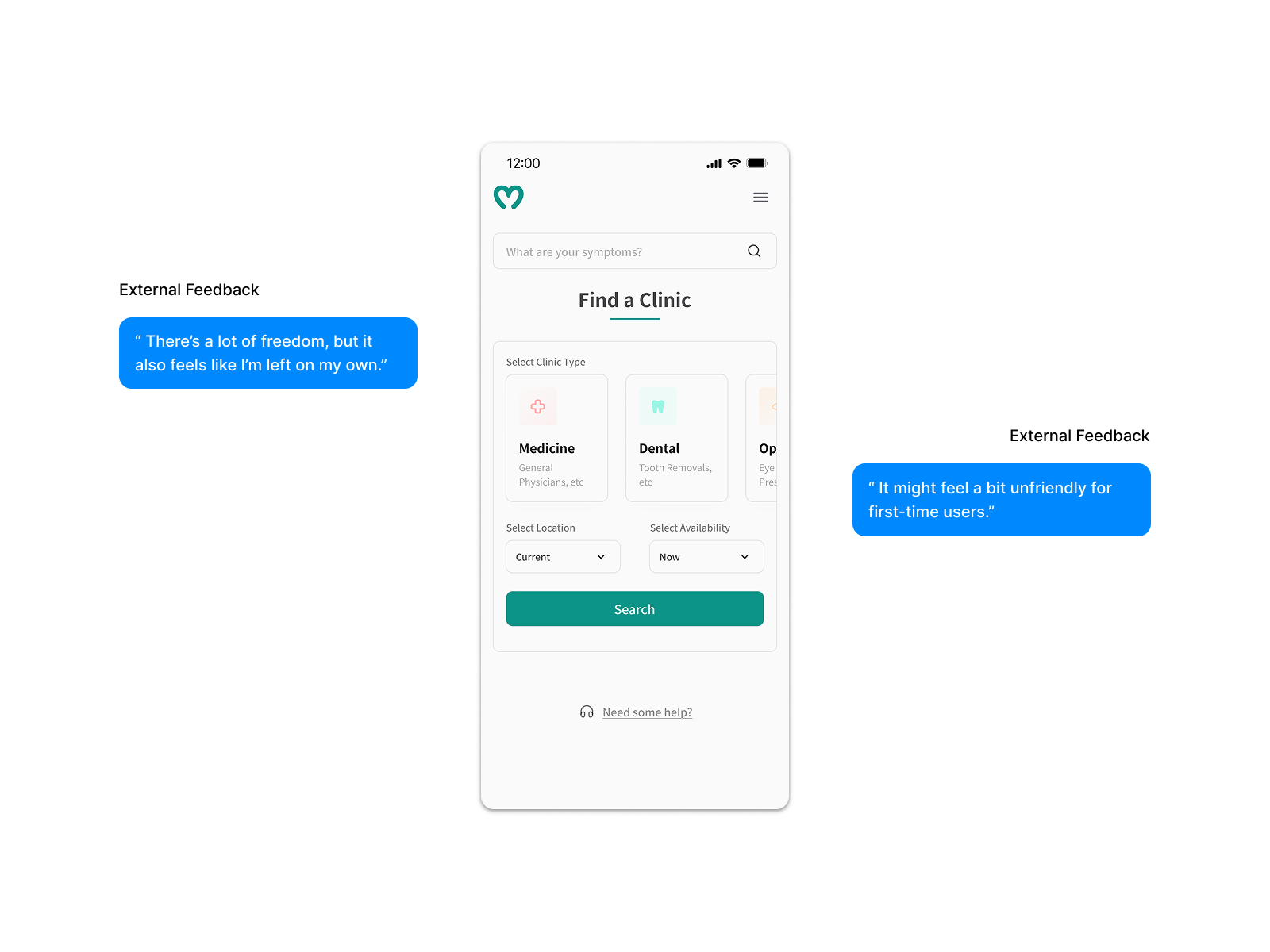
Japanese digital products tend toward completeness as a credibility signal — a sparse screen reads as unfinished, and unfinished in healthcare reads as untrustworthy. I’d run dedicated cultural benchmarking earlier rather than assuming minimalist conventions would translate. I’d also nail down two open questions from the start: where availability information sits in the flow, and what proxy we’d use for off-screen booking completion — rather than arriving at both under timeline pressure.